Chapter 17 (Normal) Hierarchical Models with Predictors
In Chapter 15 we convinced you that there’s a need for hierarchical models. In Chapter 16 we built our first hierarchical model – a Normal hierarchical model of with no predictors . Here we’ll take the next natural step by building a Normal hierarchical regression model of with predictors . Going full circle, let’s return to the Cherry Blossom 10 mile running race analysis that was featured in Chapter 15. Our goal is to better understand variability in running times: To what extent do some people run faster than others? How are running times associated with age, and to what extent does this differ from person to person?
In answering these questions, we’ll utilize the cherry_blossom_sample data from the bayesrules package, shortened to running here.
This data records multiple net running times (in minutes) for each of 36 different runners in their 50s and 60s that entered the 10-mile race in multiple years.
# Load packages
library(bayesrules)
library(tidyverse)
library(rstanarm)
library(bayesplot)
library(tidybayes)
library(broom.mixed)

# Load data
data(cherry_blossom_sample)
running <- cherry_blossom_sample
But it turns out that the running data is missing some net race times.
Since functions such as prediction_summary(), add_fitted_draws(), and add_predicted_draws() require complete information on each race, we’ll omit the rows with incomplete observations.
In doing so, it’s important to use na.omit() after selecting our variables of interest so that we don’t throw out observations that have complete information on these variables just because they have incomplete information on variables we don’t care about.
# Remove NAs
running <- running %>%
  select(runner, age, net) %>%
  na.omit()
With multiple observations per runner, this data is hierarchical or grouped. To acknowledge this grouping structure, let denote the net running time and the age for runner in their th race. In modeling by , Chapter 15 previewed that it would be a mistake to ignore the data’s grouped structure: a complete pooling approach ignores the fact that we have multiple dependent observations on each runner, and a no pooling approach assumes that data on one runner can’t tell us anything about another runner (thus that our data also can’t tell us anything about the general running population). Instead, our analysis of the relationship between running times and age will combine two Bayesian modeling paradigms we’ve developed throughout the book:
- regression models of by predictors when our data does not have a group structure (Chapters 9 through 14); and
- hierarchical models of which account for group-structured data but do not use predictors (Chapter 16).
- Build hierarchical regression models of response variable by predictors .
- Evaluate and compare hierarchical and non-hierarchical models.
- Use hierarchical models for posterior prediction.
17.1 First steps: Complete pooling
To explore the association between running times () and age (), let’s start by ignoring the data’s grouped structure. This isn’t the right approach, but it provides a good point of comparison and a building block to a better model. To this end, the complete pooled regression model of from Chapter 15 assumes an age-specific linear relationship with weakly informative priors:
This model depends upon three global parameters: intercept , age coefficient , and variability from the regression model .
Our posterior simulation results for these parameters from Section 15.1, stored in complete_pooled_model, are summarized below.
# Posterior summary statistics
model_summary <- tidy(complete_pooled_model,
                      conf.int = TRUE, conf.level = 0.80)
model_summary
# A tibble: 2 x 5
  term        estimate std.error conf.low conf.high
  <chr>          <dbl>     <dbl>    <dbl>     <dbl>
1 (Intercept)   75.2      24.6     43.7     106.
2 age            0.268     0.446   -0.302     0.842
The vibe of this complete pooled model is captured by Figure 17.1: it lumps together all race results and describes the relationship between running time and age by a common global model.
Lumped together in this way, a scatterplot of net running times versus age exhibit a weak relationship with a posterior median model of 75.2 0.268 age.
# Posterior median model
B0 <- model_summary$estimate[1]
B1 <- model_summary$estimate[2]
ggplot(running, aes(x = age, y = net)) +
  geom_point() +
  geom_abline(aes(intercept = B0, slope = B1))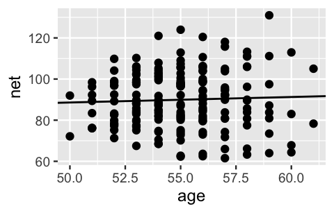
FIGURE 17.1: A scatterplot of net running times versus age along with the posterior median model from the complete pooled model.
This posterior median estimate of the age coefficient suggests that running times tend to increase by a mere 0.27 minutes for each year in age. Further, with an 80% posterior credible interval for which straddles 0, (-0.3, 0.84), our complete pooled regression model suggests there’s not a significant relationship between running time and age. Our intuition (and personal experience) says this is wrong – as adults age they tend to slow down. This intuition is correct.
17.2 Hierarchical model with varying intercepts
17.2.1 Model building
Chapter 15 revealed that it would indeed be a mistake to stop our runner analysis with the complete pooled regression model (17.1). Thus, our next goal is to incorporate the data’s grouped structure while maintaining our age predictor . Essentially, we want to combine the regression principles from the complete pooled regression model with the grouping principles from the simple Normal hierarchical model without a predictor from Chapter 16:
This hierarchical regression model will build from (17.2) and unfold in three similar layers.
17.2.1.1 Layer 1: Variability within runner
The first layer of the simple Normal hierarchical model (17.2) assumes that each runner’s net running times vary normally around their own mean time , with no consideration of their age :
To incorporate information about age into our understanding of running times within runners, we can replace the with runner-specific means , which depend upon the runner’s age in their th race, . There’s more than one approach, but we’ll start with the following:
Thus, the first layer of our hierarchical model describes the relationship between net times and age within each runner by:
For each runner , (17.3) assumes that their running times are Normally distributed around an age- and runner-specific mean, , with standard deviation . This model depends upon three parameters: , , and . Paying special attention to subscripts, only depends upon , and thus is runner- or group-specific:
- = intercept of the regression model for runner .
The other parameters are global, or shared across all runners :
- = global age coefficient, i.e., the typical change in a runner’s net time per one year increase in age; and
- = within-group variability around the mean regression model , and hence a measure of the strength of the relationship between an individual runner’s time and their age.
Putting this together, the first layer of our hierarchical model (17.3) assumes that relationships between running time and age randomly vary from runner to runner, having different intercepts but a shared age coefficient . Figure 17.2 illustrates these assumptions and helps us translate them within our context: though some runners tend to be faster or slower than others, runners experience roughly the same increase in running times as they age.
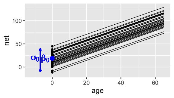
FIGURE 17.2: Hypothetical mean regression models, , for our 36 sampled runners under (17.3). The black dots represent the runner-specific intercepts which vary normally around with standard deviation .
17.2.1.2 Layer 2: Variability between runners
As with the simple hierarchical model (17.2), the first layer of our hierarchical regression model (17.3) captured the relationship between running time and age within runners. It’s in the next layer that we must capture how the relationships between running time and age vary from runner to runner, i.e., between runners.
Which of our current model parameters, , will we model in the next layer of the hierarchical model? What is a reasonable structure for this model?
Since it’s the only regression feature that we’re assuming can vary from runner to runner, the next layer will model variability in the intercept parameters . It’s important to recognize here that our 36 sample runners are drawn from the same broader population of runners. Thus, instead of taking a no pooling approach, which assigns each a unique prior, and hence assumes that one runner can’t tell us about another, these intercepts should share a prior. To this end we’ll assume that the runner-specific intercept parameters, and hence baseline running speeds, vary normally around some mean with standard deviation :
Figure 17.2 adds context to this layer of the hierarchical model which depends upon two new parameters:
- = the global average intercept across all runners, i.e., the average runner’s baseline speed; and
- = between-group variability in intercepts , i.e., the extent to which baseline speeds vary from runner to runner.
17.2.1.3 Layer 3: Global priors
We’ve now completed the first two layers of our hierarchical regression model which reflect the relationships of running time and age, within and between runners. As with any Bayesian model, the last step is to specify our priors.
For which model parameters must we specify priors in the final layer of our hierarchical regression model?
Building from (17.3) and (17.4), the final layer of our hierarchical regression model must specify priors for the global parameters: , , , and . It’s these global parameters that describe the entire population of runners, not just those in our sample. As usual, we’ll utilize independent Normal priors for regression coefficients and , where our prior understanding of baseline is expressed through the centered intercept . Further, we’ll utilize independent Exponential priors for standard deviation terms and . The final hierarchical regression model thus combines information about the relationship between running times and age within runners (17.3) with information about how baseline speeds vary between runners (17.4) with our prior understanding of the broader global population of runners. As embodied by Figure 17.2, this particular model is often referred to as a hierarchical random intercepts model:
The complete set of model assumptions is summarized below.
Normal hierarchical regression assumptions
Let and denote observations for the th observation in group . The appropriateness of the Bayesian Normal hierarchical regression model (17.5) of by depends upon the following assumptions.
- Structure of the data
Conditioned on predictor , the outcomes on any one group are independent of those on another group , . However, different data points within the same group , and , are correlated. - Structure of the relationship
Within any group , the typical outcome of () can be written as a linear function of predictor . - Structure of the variability within groups
Within any group and at any predictor value , the observed values of will vary normally around mean with consistent standard deviation . - Structure of the variability between groups
The group-specific baselines or intercepts, , vary normally around a global intercept with standard deviation .
17.2.2 Another way to think about it
Recall from Chapter 16 that there are two ways to think about group-specific parameters. First, in our hierarchical regression model of running times (17.5), we incorporated runner-specific intercept parameters to indicate that the baseline speed can vary from runner to runner . We thought of these runner-specific intercepts as normal deviations from some global intercept with standard deviation : . Equivalently, we can think of the runner-specific intercepts as random tweaks or adjustments to ,
where these tweaks are normal deviations from 0 with standard deviation :
Consider an example. Suppose that some runner has a baseline running speed of minutes, whereas the average baseline speed across all runners is minutes. Thus, at any age, runner tends to run 5 minutes slower than average. That is, and
In general, then, we can reframe Layers 1 and 2 of our hierarchical model (17.5) as follows:
17.2.3 Tuning the prior
With the hierarchical regression model framework in place (17.5), let’s tune the priors to match our prior understanding in this running context. Pretending that we didn’t already see data in Chapter 15, our prior understanding is as follows:
- The typical runner in this age group runs somewhere between an 8-minute mile and a 12-minute mile during a 10-mile race, and thus has a net time somewhere between 80 and 120 minutes for the entire race. As such we’ll set the prior model for the centered global intercept to . (This centered intercept is much easier to think about than the raw intercept , the typical net time for a 0-year-old runner!)
- We’re pretty sure that the typical runner’s net time in the 10-mile race will, on average, increase over time. We’re not very sure about the rate of this increase, but think it’s likely between 0.5 and 4.5 minutes per year. Thus, we’ll set our prior for the global age coefficient to .
- Beyond the typical net time for the typical runner, we do not have a clear prior understanding of the variability between runners (), nor of the degree to which a runner’s net times might fluctuate from their regression trend (). Thus, we’ll utilize weakly informative priors on these standard deviation parameters.
Our final tuning of the hierarchical random intercepts model follows, where the priors on and are assigned by the stan_glmer() simulation below:
To get a sense for the combined meaning of our prior models, we simulate 20,000 prior parameter sets using stan_glmer() with the following special arguments:
- We specify the model of
nettimes byageby the formulanet ~ age + (1 | runner). This essentially combines a non-hierarchical regression formula (net ~ age) with that for a hierarchical model with no predictor (net ~ (1 | runner)). - We specify
prior_PD = TRUEto indicate that we wish to simulate parameters from the prior, not posterior, models.
running_model_1_prior <- stan_glmer(
  net ~ age + (1 | runner),
  data = running, family = gaussian,
  prior_intercept = normal(100, 10),
  prior = normal(2.5, 1),
  prior_aux = exponential(1, autoscale = TRUE),
  prior_covariance = decov(reg = 1, conc = 1, shape = 1, scale = 1),
  chains = 4, iter = 5000*2, seed = 84735,
  prior_PD = TRUE)
The simulation results describe 20,000 prior plausible scenarios for the relationship between running time and age, within and between our 36 runners. Though we encourage you to plot many more on your own, we show just 4 prior plausible scenarios of what the mean regression models, , might look like for our 36 runners (Figure 17.3 left). The variety across these prior scenarios reflects our general uncertainty about running. Though each scenario is consistent with our sense that runners likely slow down over time, the rate of increase ranges quite a bit. Further, in examining the distances between the runner-specific regression lines, some scenarios reflect a plausibility that there’s little difference between runners, whereas others suggest that some runners might be much faster than others.
Finally, we also simulate 100 datasets of race outcomes from the prior model, across a variety of runners and ages.
The 100 density plots in Figure 17.3 (right) reflect the distribution of the net times in these simulated datasets.
There is, again, quite a range in these simulations.
Though some span ridiculous outcomes (e.g., negative net running times), the variety in the simulations and the general set of values they cover, adequately reflect our prior understanding and uncertainty.
For example, since a 25- to 30-minute mile is a good walking (not running) pace, the upper values near 250-300 minutes for the entire 10-mile race seem reasonable.
set.seed(84735)
running %>%
  add_fitted_draws(running_model_1_prior, n = 4) %>%
  ggplot(aes(x = age, y = net)) +
    geom_line(aes(y = .value, group = paste(runner, .draw))) +
    facet_wrap(~ .draw)

running %>%
  add_predicted_draws(running_model_1_prior, n = 100) %>%
  ggplot(aes(x = net)) +
    geom_density(aes(x = .prediction, group = .draw)) +
    xlim(-100,300)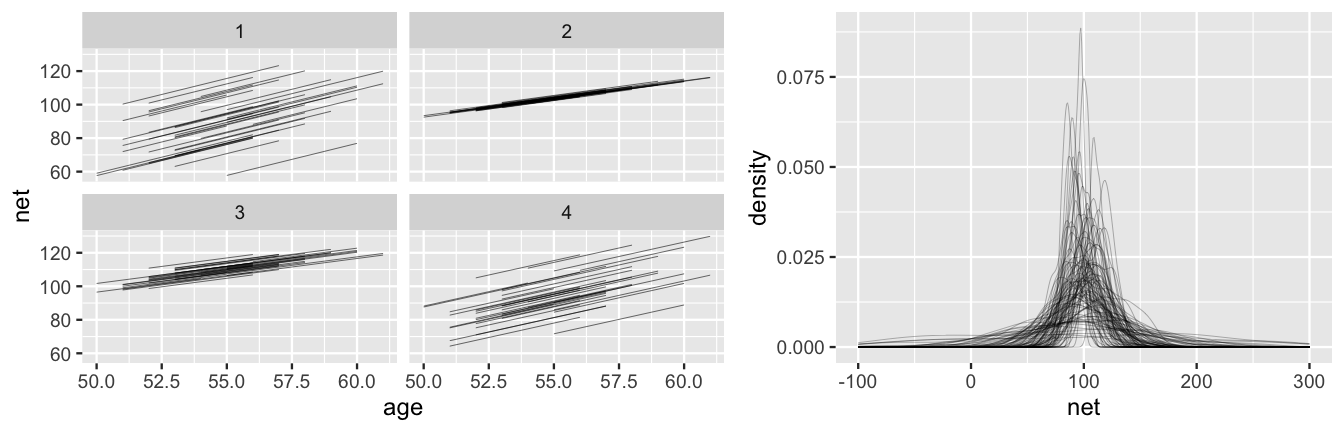
FIGURE 17.3: Simulated scenarios under the prior models of the hierarchical regression model (17.7). At left are 4 prior plausible sets of 36 runner-specific relationships between running time and age, . At right are density plots of 100 prior plausible sets of net running time data.
17.2.4 Posterior simulation & analysis
After all of the buildup, let’s counter our prior understanding of the relationship between running time and age with some data. We plot the running times by age for each of our 36 runners below. This reaffirms our model-building process and some of our prior hunches. Most runners’ times do tend to increase with age, and there is variability between the runners themselves – some tend to be faster than others.
ggplot(running, aes(x = age, y = net)) +
  geom_point() +
  facet_wrap(~ runner)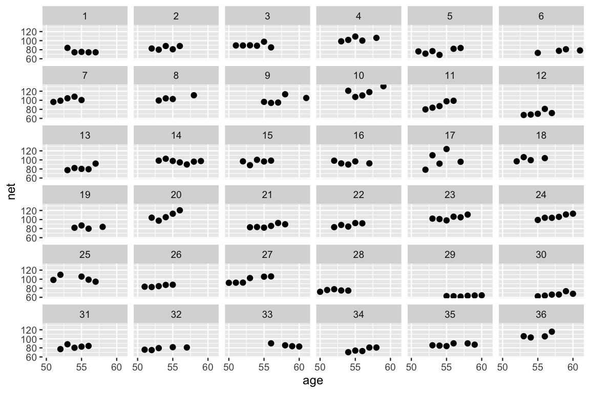
FIGURE 17.4: Scatterplots of the net running time by age for each of the 36 runners.
Combining our prior understanding with this data, we take a syntactical shortcut to simulate the posterior random intercepts model (17.5) of net times by age: we update() the running_model_1_prior with prior_PD = FALSE.
We encourage you to follow this up with a check of the prior tunings as well as some Markov chain diagnostics:
# Simulate the posterior
running_model_1 <- update(running_model_1_prior, prior_PD = FALSE)

# Check the prior specifications
prior_summary(running_model_1)

# Markov chain diagnostics
mcmc_trace(running_model_1)
mcmc_dens_overlay(running_model_1)
mcmc_acf(running_model_1)
neff_ratio(running_model_1)
rhat(running_model_1)
There are a whopping 40 parameters in our model: 36 runner-specific intercept parameters () in addition to 4 global parameters ().
These are labeled as follows in the stan_glmer() simulation results:
(Intercept)=age=b[(Intercept) runner:j]= , the difference between runner ’s baseline speed and the average baseline speedsigma=Sigma[runner:(Intercept),(Intercept)]=
We’ll keep our focus on the big themes here, first those related to the relationship between running time and age for the typical runner, and then those related to the variability from this average.
17.2.4.1 Posterior analysis of the global relationship
To begin, consider the global relationship between running time and age for the typical runner:
Posterior summaries for and , which are fixed across runners, are shown below.
tidy_summary_1 <- tidy(running_model_1, effects = "fixed",
                       conf.int = TRUE, conf.level = 0.80)
tidy_summary_1
# A tibble: 2 x 5
  term        estimate std.error conf.low conf.high
  <chr>          <dbl>     <dbl>    <dbl>     <dbl>
1 (Intercept)    19.1     11.9       3.74     34.5
2 age             1.30     0.213     1.02      1.58
Accordingly, there’s an 80% chance that the typical runner tends to slow down somewhere between 1.02 and 1.58 minutes per year.
The fact that this range is entirely and comfortably above 0 provides significant evidence that the typical runner tends to slow down with age.
This assertion is visually supported by the 200 posterior plausible global model lines below, superimposed with their posterior median, all of which exhibit positive associations between running time and age.
In plotting these model lines, note that we use add_fitted_draws() with re_formula = NA to specify that we are interested in the global, not group-specific, model of running times:
B0 <- tidy_summary_1$estimate[1]
B1 <- tidy_summary_1$estimate[2]
running %>%
  add_fitted_draws(running_model_1, n = 200, re_formula = NA) %>%
  ggplot(aes(x = age, y = net)) +
    geom_line(aes(y = .value, group = .draw), alpha = 0.1) +
    geom_abline(intercept = B0, slope = B1, color = "blue") +
    lims(y = c(75, 110))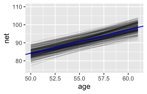
FIGURE 17.5: 200 posterior plausible global model lines, , for the relationship between running time and age.
Statistical vs practical significance
When we use the term “significant” in the discussion above, we’re referring to statistical significance. This merely indicates that a positive relationship exists. In this case, we also believe that a per-year slowdown of 1.02 to 1.58 minutes is of a meaningful magnitude that has real-world implications. That is, this positive relationship is also practically significant.
Don’t let the details distract you from the important punchline here!
By incorporating the group structure of our data, our hierarchical random intercepts model has what the complete pooled model (17.1) lacked: the power to detect a significant relationship between running time and age.
Our discussion in Chapter 15 revealed why this happens in our running analysis: pooling all runners’ data together masks the fact that most individual runners slow down with age.
17.2.4.2 Posterior analysis of group-specific relationships
In our next step, let’s examine what the hierarchical random intercepts model reveals about the runner-specific relationships between net running time and age,
We’ll do so by combining what we learned about the global age parameter above, with information on the runner-specific intercept terms .
The latter will require the specialized syntax we built up in Chapter 16, and thus some patience.
First, the b[(Intercept) runner:j] chains correspond to the difference in the runner-specific and global intercepts .
Thus, we obtain MCMC chains for each by adding the (Intercept) chain to the b[(Intercept) runner:j] chains via spread_draws() and mutate().
We then use median_qi() to obtain posterior summaries of the chain for each runner :
# Posterior summaries of runner-specific intercepts
runner_summaries_1 <- running_model_1 %>%
  spread_draws(`(Intercept)`, b[,runner]) %>%
  mutate(runner_intercept = `(Intercept)` + b) %>%
  select(-`(Intercept)`, -b) %>%
  median_qi(.width = 0.80) %>%
  select(runner, runner_intercept, .lower, .upper)
Consider the results for runners 4 and 5. With a posterior median intercept of 30.8 minutes vs 6.7 minutes, runner 4 seems to have a slower baseline speed than runner 5. Thus, at any shared age, we would expect runner 4 to run roughly 24.1 minutes slower than runner 5 ():
runner_summaries_1 %>%
  filter(runner %in% c("runner:4", "runner:5"))
# A tibble: 2 x 4
  runner   runner_intercept .lower .upper
  <chr>               <dbl>  <dbl>  <dbl>
1 runner:4            30.8   15.3    46.3
2 runner:5             6.66  -8.42   21.9
These observations are echoed in the plots below, which display 100 posterior plausible models of net time by age for runners 4 and 5:
# 100 posterior plausible models for runners 4 & 5
running %>%
  filter(runner %in% c("4", "5")) %>%
  add_fitted_draws(running_model_1, n = 100) %>%
  ggplot(aes(x = age, y = net)) +
    geom_line(
      aes(y = .value, group = paste(runner, .draw), color = runner),
      alpha = 0.1) +
    geom_point(aes(color = runner))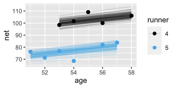
FIGURE 17.6: 100 posterior plausible models of running time by age, , for subjects .
We can similarly explore the models for all 36 runners, . For a quick comparison, the runner-specific posterior median models are plotted below and superimposed with the posterior median global model, . This drives home the point that the global model represents the relationship between running time and age for the most average runner. The individual runner models vary around this global average, some with faster baseline speeds () and some with slower baseline speeds ().
# Plot runner-specific models with the global model
ggplot(running, aes(y = net, x = age, group = runner)) +
  geom_abline(data = runner_summaries_1, color = "gray",
              aes(intercept = runner_intercept, slope = B1)) +
  geom_abline(intercept = B0, slope = B1, color = "blue") +
  lims(x = c(50, 61), y = c(50, 135))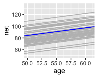
FIGURE 17.7: The posterior median models for our 36 runners as calculated from the hierarchical random intercepts model (gray), with the posterior median global model (blue).
17.2.4.3 Posterior analysis of within- and between-group variability
All of this talk about the variability in runner-specific models brings us to a posterior consideration of the final remaining model parameters, and . Whereas measures the variability from the mean regression model within each runner, measures the variability in baseline running speeds between the runners. The simulated datasets in Figure 17.8 provide some intuition. In scenario (a), the variability from the mean model within both groups () is quite small relative to the variability in the models between the groups (), leading to a great distinction between these two groups. In scenario (b), is larger than , leading to little distinction between the groups.
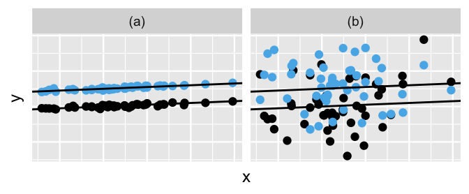
FIGURE 17.8: Simulated output for the relationship between response variable and predictor when (a) and (b).
Posterior tidy() summaries for our variance parameters suggest that the running analysis is more like scenario (a) than scenario (b).
For a given runner , we estimate that their observed running time at any age will deviate from their mean regression model by roughly 5.25 minutes ().
By the authors’ assessment (none of us professional runners!), this deviation is rather small in the context of a long 10-mile race, suggesting a rather strong relationship between running times and age within runners.
In contrast, we expect that baseline speeds vary by roughly 13.3 minutes from runner to runner ().
tidy_sigma <- tidy(running_model_1, effects = "ran_pars")
tidy_sigma
# A tibble: 2 x 3
  term                    group    estimate
  <chr>                   <chr>       <dbl>
1 sd_(Intercept).runner   runner      13.3
2 sd_Observation.Residual Residual     5.25
Comparatively then, the posterior results suggest that – there’s greater variability in the models between runners than variability from the model within runners. Think about this another way. As with the simple hierarchical model in Section 16.3.3, we can decompose the total variability in race times across all runners and races into that explained by the variability between runners and that explained by the variability within each runner (16.8):
Thus, proportionally (16.9), differences between runners account for roughly 86.62% (the majority!) of the total variability in racing times, with fluctuations among individual races within runners explaining the other 13.38%:
sigma_0 <- tidy_sigma[1,3]
sigma_y <- tidy_sigma[2,3]
sigma_0^2 / (sigma_0^2 + sigma_y^2)
  estimate
1   0.8662
sigma_y^2 / (sigma_0^2 + sigma_y^2)
  estimate
1   0.1338
17.3 Hierarchical model with varying intercepts & slopes
Since you’ve gotten this far in the book, you know that once in a while it’s important to stand back from the details and ask: can we do even better? A plot of the data for just four of our runners, Figure 17.9, suggests that the hierarchical random intercepts model (17.5) might oversimplify reality. Though this model recognizes that some runners tend to be faster than others, it assumes that the change in running time with age () is the same for each runner. In reality, whereas some runners do slow down at similar rates (e.g., runners 4 and 5), some slow down quicker (e.g., runner 20) and some barely at all (e.g., runner 29).
# Plot runner-specific models in the data
running %>%
  filter(runner %in% c("4", "5", "20", "29")) %>%
  ggplot(., aes(x = age, y = net)) +
    geom_point() +
    geom_smooth(method = "lm", se = FALSE) +
    facet_grid(~ runner)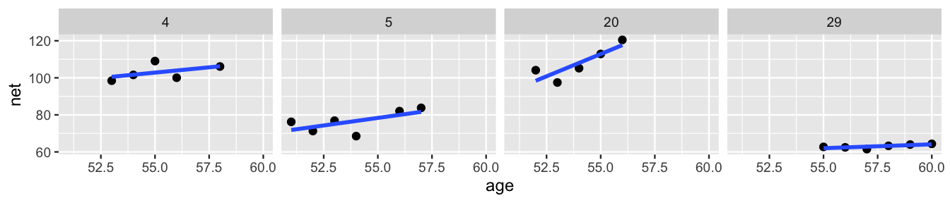
FIGURE 17.9: Scatterplots and observed trends in running times vs age for four subjects.
A snapshot of the observed trends for all 36 runners provides a more complete picture of just how much the change in net time with age might vary by runner:
ggplot(running, aes(x = age, y = net, group = runner)) +
  geom_smooth(method = "lm", se = FALSE, size = 0.5)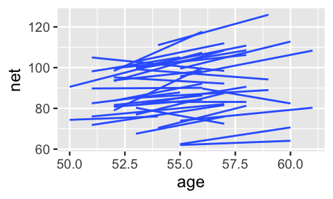
FIGURE 17.10: Observed trends in running time versus age for the 36 subjects (gray) along with the posterior median model (blue).
How can we modify the random intercepts model (17.5) to recognize that the rate at which running time changes with age might vary from runner to runner?
17.3.1 Model building
Inspired by Figure 17.10, our goal is to build a model which recognizes that in the relationship between running time and age, both the intercept (i.e., baseline speed) and slope (i.e., rate at which speed changes with age) might vary from runner to runner. To this end, we can replace the global age coefficient in (17.5) by a runner-specific coefficient . Thus, the model of the relationship between running time and age within each runner becomes:
Accordingly, just as we assumed in (17.5) that the runner-specific intercepts are Normally distributed around some global intercept with standard deviation , we now also assume that the runner-specific age coefficients are Normally distributed around some global age coefficient with standard deviation :
But these priors aren’t yet complete – and work together to describe the model for runner , and thus are correlated. Let represent the correlation between and . To reflect this correlation, we represent the joint Normal model of and by
where is the joint mean and is the 2x2 covariance matrix which encodes the variability and correlation amongst and :
Though this notation looks overwhelming, it simply indicates that and are both marginally Normal (17.9) and have correlation . The correlation between the runner-specific intercepts and slopes, and , isn’t just a tedious mathematical detail. It’s an interesting feature of the hierarchical model! Figure 17.11 provides some insight. Plot (a) illustrates the scenario in which there’s a strong negative correlation between and – models that start out lower (with small ) tend to increase at a more rapid rate (with higher ). In plot (c) there’s a strong positive correlation between and – models that start out higher (with larger ) also tend to increase at a more rapid rate (with higher ). In between these two extremes, plot (b) illustrates the scenario in which there’s no correlation between the group-specific intercepts and slopes.
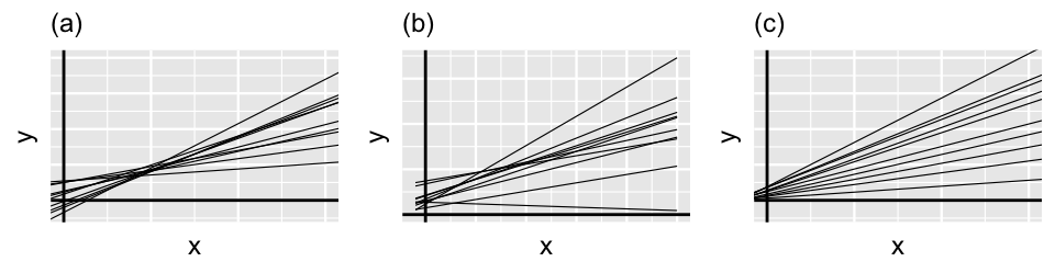
FIGURE 17.11: Simulated output for the relationship between response variable and predictor when (a), (b), and (c).
Consider the implications of this correlation in the context of our running analysis.74
- In our running example, what would it mean for and to be negatively correlated?
- Runners that start out slower (i.e., with a higher baseline), also tend to slow down at a more rapid rate.
- The rate at which runners slow down over time isn’t associated with how fast they start out.
- Runners that start out faster (i.e., with a lower baseline), tend to slow down at a more rapid rate.
- Similarly, what would it mean for and to be positively correlated?
The completed hierarchical model (17.12) pulls together (17.8) and (17.10) with priors for the global parameters. For reasons you might imagine, this is often referred to as a hierarchical random intercepts and slopes model:
Equivalently, we can re-express the random intercepts and slopes as random tweaks to the global intercept and slope: with
Connecting our hierarchical models
The random intercepts model (17.5) is a special case of (17.12). When , i.e., when the group-specific age coefficients do not differ from group to group, these two models are equivalent.
Most of the pieces in this model are familiar.
For global parameters and we use the tuned Normal priors from (17.7).
For we use a weakly informative prior.
Yet there is one big new piece.
We need a joint prior model to express our understanding of how the combined , , and parameters define covariance matrix (17.11).
At the writing of this book, the stan_glmer() function allows users to define this prior through a decomposition of covariance, or decov(), model.
Very generally speaking, this model decomposes our prior model for the covariance matrix into prior information about three separate pieces:
the correlation between the group-specific intercepts and slopes, (Figure 17.11);
the combined degree to which the intercepts and slopes vary by group, ; and75
the relative proportion of this variability between groups that’s due to differing intercepts vs differing slopes,
Figure 17.12 provides some context on this third piece, displaying a few scenarios for the relationship between and . In general, and always sum to 1, and thus have a push-and-pull relationship. For example, when and , the variability in intercepts () is large in comparison to the variability in slopes (). Thus, the majority of the variability between group-specific models is explained by differences in intercepts (plot a). In contrast, when and , the majority of the variability between group-specific models is explained by differences in slopes (plot c). In between these extremes, when and are both approximately 0.5, roughly half of the variability between groups can be explained by differing intercepts and the other half by differing slopes (plot b).
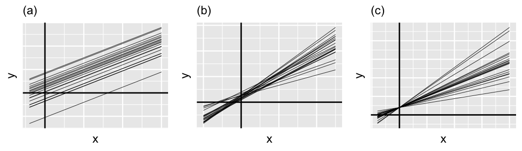
FIGURE 17.12: Simulated output for the relationship between response variable and predictor when and (a), (b), and and (c).
In our analysis, we’ll utilize the weakly informative default setting for the hierarchical random intercepts and slopes model: decov(reg = 1, conc = 1, shape = 1, scale = 1) in rstanarm notation.
This makes the following prior assumptions regarding the three pieces above:
- the correlation is equally likely to be anywhere between -1 and 1;
- we have weakly informative prior information about the total degree to which the intercepts and slopes vary by runner; and
- the relative proportion of the variability between runners that’s due to differing intercepts is equally likely to be anywhere between 0 and 1, i.e., we’re not at all sure if there’s more, less, or the same level of variability in the baseline speeds from runner to runner, , than in the rate at which their speeds change over time, .
We’ll utilize these default assumptions for the covariance prior in this book. Beyond the defaults, specifying and tuning the decomposition of covariance prior requires the acquisition of two new probability models. We present more optional detail in the next section and refer the curious reader to Gabry and Goodrich (2020a) for a more mathematical treatment that scales up to models beyond those considered here.
17.3.2 Optional: The decomposition of covariance model
Let’s take a closer look at the decomposition of covariance model. To begin, we define the three pieces that are important to specifying our prior understanding of the random intercepts and slopes covariance matrix (17.11), and thus the parameters by which it’s defined. These pieces are numbered in accordance to their corresponding interpretations above:
We can decompose into a product which depends on , , and . If you know some linear algebra, you can confirm this result, though the fact that we can rewrite is what’s important here:
We can further decompose into the product of and :
And since we can rewrite using , , and , we can also express our prior understanding of by our combined prior understanding of these three pieces. This joint prior, which we simply expressed above by
is actually defined by three individual priors:
Let’s begin with the “LKJ” prior model on the correlation matrix with regularization hyperparameter . In our model (17.12), depends only on the correlation between the group-specific intercepts and slopes . Thus, the LKJ prior model simplifies to a prior model on with pdf
Figure 17.13 displays the LKJ pdf under a variety of regularization parameters , illustrating the important comparison of to 1:
- Setting indicates a prior understanding that the group-specific intercepts and slopes are most likely strongly correlated, though we’re not sure if this correlation is negative or positive.
- When , the LKJ model is uniform from -1 to 1, indicating that the correlation between the intercepts and slopes is equally likely to be anywhere in this range – we’re not really sure.
- Setting indicates a prior understanding that the group-specific intercepts and slopes are most likely weakly correlated (). The greater is, the tighter and tighter the LKJ hugs values of near 0.
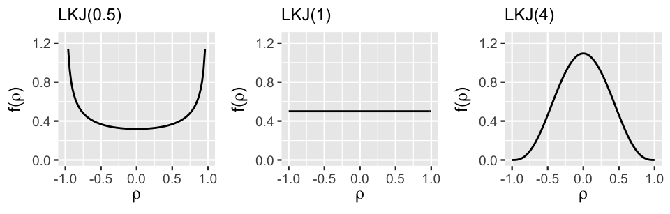
FIGURE 17.13: The LKJ pdf under three regularization parameters.
Next, for the total standard deviation in the intercepts and slopes, , we utilize the “usual” Gamma prior (or its Exponential special case). Finally, consider the prior for the and parameters. Recall that and measure the relative proportion of the variability between groups that’s due to differing intercepts vs differing slopes, respectively. Thus, and are both restricted to values between 0 and 1 and must sum to 1:
Accordingly, we can utilize a joint symmetric Dirichlet prior with concentration hyperparameter for . The symmetric Dirichlet pdf defines the relative prior plausibility of valid pairs:
In fact, in the special case when we have only two group-specific parameters, and , the symmetric Dirichlet model for is equivalently expressed by:
Figure 17.14 displays the marginal symmetric Dirichlet pdf, i.e., Beta pdf, for under a variety of concentration parameters , illustrating the important comparison of to 1:
- Setting places more prior weight on proportions near 0 or 1. This indicates a prior understanding that relatively little () or relatively much () of the variability between groups is explained by differences in intercepts rather than differences in slopes (Figure 17.12 plots a and c).
- When , the marginal pdf on is uniform from 0 to 1, indicating that the variability in intercepts explains anywhere between 0 and all of the variability between groups – we’re not really sure.
- Setting indicates a prior understanding that roughly half of the variability between groups is explained by differences in intercepts and the other half by differences in slopes (Figure 17.12 plot b). The greater is, the tighter and tighter this prior hugs values of near 0.5.
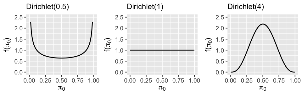
FIGURE 17.14: The marginal symmetric Dirichlet pdf under three concentration parameters.
When our models have both group-specific intercepts and slopes, we’ll use the following default decomposition of variance priors which indicate general uncertainty about the correlation between group-specific intercepts and slopes, the overall variability in group-specific model, and the relative degree to which this variability is explained by differing intercepts vs differing slopes:
In rstanarm notation, this prior is expressed by decov(reg = 1, conc = 1, shape = 1, scale = 1).
To tune this prior, you can change the LKJ regularization parameter , the Gamma shape and scale parameters, and the Dirichlet concentration parameter .
17.3.3 Posterior simulation & analysis
Finally, let’s simulate the posterior of our hierarchical random intercepts and slopes model of running times (17.12).
This requires one minor tweak to our stan_glmer() call: instead of using the formula net ~ age + (1 | runner) we use net ~ age + (age | runner).
running_model_2 <- stan_glmer(
  net ~ age + (age | runner),
  data = running, family = gaussian,
  prior_intercept = normal(100, 10),
  prior = normal(2.5, 1),
  prior_aux = exponential(1, autoscale = TRUE),
  prior_covariance = decov(reg = 1, conc = 1, shape = 1, scale = 1),
  chains = 4, iter = 5000*2, seed = 84735, adapt_delta = 0.99999
)

# Confirm the prior model specifications
prior_summary(running_model_2)
This simulation will be sloooooooow. Notice the additional argument in our stan_glmer() syntax: adapt_delta = 0.99999. Simply put, adapt_delta is a tuning parameter for the underlying MCMC algorithm, the technical details of which are outside the scope of this book. Prior to this example, we’ve been running our simulations using the default adapt_delta value of 0.95. However, in this particular example, the default produces a warning: There were 1 divergent transitions after warmup. This warning indicates that the MCMC algorithm had a tough time exploring the posterior plausible range of our parameter values. When encountering this issue, one strategy is to increase adapt_delta to some value closer to 1. Doing so produces a much slower, but more stable, simulation. For more technical details on divergent transitions and how to address them, we recommend Modrak (2019).
17.3.3.1 Posterior analysis of the global and group-specific parameters
Remember thinking that the 40 parameters in the random intercepts model was a lot? This new model has 78 parameters: 36 runner-specific intercept parameters , 36 runner-specific age coefficients , and 6 global parameters (). Let’s examine these piece by piece, starting with the global model of the relationship between running time and age,
The results here for the random intercepts and slopes model (17.12) are quite similar to those for the random intercepts model (17.5): the posterior median model is 18.5 + 1.32 age.
# Quick summary of global regression parameters
tidy(running_model_2, effects = "fixed", conf.int = TRUE, conf.level = 0.80)
# A tibble: 2 x 5
  term        estimate std.error conf.low conf.high
  <chr>          <dbl>     <dbl>    <dbl>     <dbl>
1 (Intercept)    18.5     11.6       3.61     33.6
2 age             1.32     0.217     1.04      1.59
Since the global mean model captures the relationship between running time and age for the average runner, we shouldn’t be surprised that our two hierarchical models produced similar assessments. Where these two models start to differ is in their assessments of the runner-specific relationships. Obtaining the MCMC chains for the runner-specific intercepts and slopes gets quite technical. We encourage you to pick through the code below, line by line. Here are some important details to pick up on:
spread_draws()usesb[term, runner]to grab the chains for all runner-specific parameters. As usual now, these chains correspond to and , the differences between the runner-specific vs global intercepts and age coefficients.pivot_wider()creates separate columns for each of the and chains and names theseb_(Intercept)andb_age.mutate()obtains the runner-specific intercepts , namedrunner_intercept, by summing the global(Intercept)and runner-specific adjustmentsb_(Intercept). The runner-specific coefficients,runner_age, are created similarly.
# Get MCMC chains for the runner-specific intercepts & slopes
runner_chains_2 <- running_model_2 %>%
  spread_draws(`(Intercept)`, b[term, runner], `age`) %>%
  pivot_wider(names_from = term, names_glue = "b_{term}",
              values_from = b) %>%
  mutate(runner_intercept = `(Intercept)` + `b_(Intercept)`,
         runner_age = age + b_age)
From these chains, we can obtain the posterior medians for each runner-specific intercept and age coefficient.
Since we’re only obtaining posterior medians here, we use summarize() in combination with group_by() instead of using the median_qi() function:
# Posterior medians of runner-specific models
runner_summaries_2 <- runner_chains_2 %>%
  group_by(runner) %>%
  summarize(runner_intercept = median(runner_intercept),
            runner_age = median(runner_age))

# Check it out
head(runner_summaries_2, 3)
# A tibble: 3 x 3
  runner    runner_intercept runner_age
  <chr>                <dbl>      <dbl>
1 runner:1              18.6       1.06
2 runner:10             18.5       1.75
3 runner:11             18.5       1.32
Figure 17.15 plots the posterior median models for all 36 runners.
ggplot(running, aes(y = net, x = age, group = runner)) +
  geom_abline(data = runner_summaries_2, color = "gray",
              aes(intercept = runner_intercept, slope = runner_age)) +
  lims(x = c(50, 61), y = c(50, 135))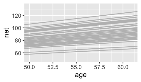
FIGURE 17.15: The posterior median models for the 36 runners, as calculated from the hierarchical random intercepts and slopes model.
Hmph. Are you surprised? We were slightly surprised. The slopes do differ, but not as drastically as we expected. But then we remembered – shrinkage! Consider sample runners 1 and 10. Their posteriors suggest that, on average, runner 10’s running time increases by just 1.06 minute per year, whereas runner 1’s increases by 1.75 minutes per year:
runner_summaries_2 %>%
  filter(runner %in% c("runner:1", "runner:10"))
# A tibble: 2 x 3
  runner    runner_intercept runner_age
  <chr>                <dbl>      <dbl>
1 runner:1              18.6       1.06
2 runner:10             18.5       1.75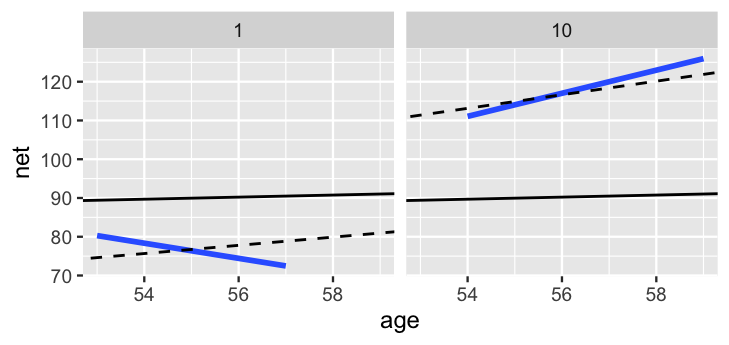
FIGURE 17.16: For runners 1 and 10, the posterior median relationships between running time and age from the hierarchical random intercepts and slopes model (dashed) are contrasted by the observed no pooled models (blue) and the complete pooled model (black).
Figure 17.16 contrasts these posterior median models for runners 1 and 10 (dashed lines) by the complete pooled posterior models (black) and no pooled posterior models (blue). As usual, the hierarchical models strike a balance between these two extremes. Like the no pooled models, the hierarchical models do vary between the two runners. Yet the difference is not as stark. The hierarchical models are drawn away from the no pooled models and toward the complete pooled models. Though this shrinkage is subtle for runner 10, the association between running time and age switches from negative to positive for runner 1. This is to be expected. Unlike the no pooled approach, which models runner-specific relationships using only runner-specific data, our hierarchical model assumes that one runner’s behavior can tell us about another’s. Further, we have very few data points on each runner – at most 7 races. With so few observations, the other runners’ information has ample influence on our posterior understanding for any one individual (as it should). In the case of runner 1, the other 35 runners’ data is enough to make us think that this runner, too, will eventually slow down.
17.3.3.2 Posterior analysis of within- and between-group variability
Stepping back, we should also ask ourselves: Is it worth it?
Incorporating the random runner-specific age coefficients introduced 37 parameters into our model of running time by age.
Yet at least visually, there doesn’t appear to be much variation among the slopes of the runner-specific models.
For a numerical assessment of this variation, we can examine the posterior trends in (sd_age.runner).
While we’re at it, we’ll also check out (sd_(Intercept).runner), (cor_(Intercept).age.runner), and (sd_Observation.Residual):
tidy(running_model_2, effects = "ran_pars")
# A tibble: 4 x 3
  term                       group    estimate
  <chr>                      <chr>       <dbl>
1 sd_(Intercept).runner      runner     1.34
2 sd_age.runner              runner     0.251
3 cor_(Intercept).age.runner runner    -0.0955
4 sd_Observation.Residual    Residual   5.17
Consider some highlights of this output:
The standard deviation in the age coefficients is likely around 0.251 minutes per year. On the scale of a 10-mile race, this indicates very little variability between the runners when it comes to the rate at which running times change with age.
Per the output for , an individual runner’s net times tend to deviate from their own mean model by roughly 5.17 minutes.
There’s a weak negative correlation of roughly -0.0955 between the runner-specific and parameters. Thus, it seems that, ever so slightly, runners that start off faster tend to slow down at a faster rate.
17.4 Model evaluation & selection
We have now built a sequence of three models of running time by age: a complete pooled model (17.1), a hierarchical random intercepts model (17.5), and a hierarchical random intercepts and slopes model (17.12). Figure 17.17 provides a reminder of the general assumptions behind these three models.
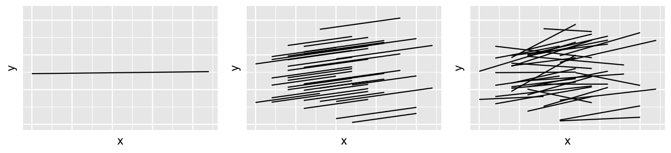
FIGURE 17.17: The idea behind three different approaches to modeling by when utilizing group-structured data: complete pooling (left), hierarchical random intercepts (middle), and hierarchical random intercepts and slopes (right).
So which one should we use? To answer this question, we can compare our three models using the framework of Chapters 10 and 11, and asking these questions: (1) How fair is each model? (2) How wrong is each model? (3) How accurate are each model’s posterior predictions? Consider question (1). The context and data collection procedure is the same for each model. Since the data has been anonymized and runners are aware that race results will be public, we think this data collection process is fair. Further, though the models produce slightly different conclusions about the relationship between running time and age (e.g., the hierarchical models conclude this relationship is significant), none of these conclusions seem poised to have a negative impact on society or individuals. Thus, our three models are equally fair.
Next, consider question (2). Posterior predictive checks suggest that the complete pooled model comparatively underestimates the variability in running times – datasets of running time simulated from the complete pooled posterior tend to exhibit a slightly narrower range than the running times we actually observed. Thus, the complete pooled model is more wrong than the hierarchical models.
pp_check(complete_pooled_model) +
  labs(x = "net", title = "complete pooled model")
pp_check(running_model_1) +
  labs(x = "net", title = "running model 1")
pp_check(running_model_2) +
  labs(x = "net", title = "running model 2")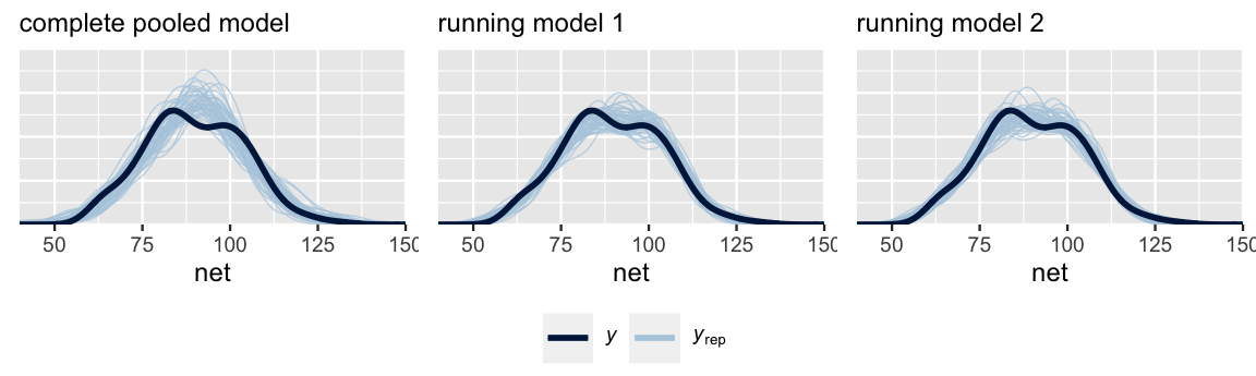
FIGURE 17.18: Posterior predictive checks of the complete pooled model (left), random intercepts model (middle), and random intercepts and slopes model (right).
In fact, we know that the complete pooled model is wrong. By ignoring the data’s grouped structure, it incorrectly assumes that each race observation is independent of the others. Depending upon the trade-offs, we might live with this wrong but simplifying assumption in some analyses. Yet at least two signs point to this being a mistake for our running analysis.
- The complete pooled model isn’t powerful enough to detect the significant relationship between running time and age.
- Not only have we seen visual evidence that some runners tend to be significantly faster or slower than others, the posterior prediction summaries in Section 17.2.4 suggest that there’s significant variability between runners ().
In light of this discussion, let’s drop the complete pooled model from consideration.
In choosing between running_model_1 and running_model_2, consider question (3): what’s the predictive accuracy of these models?
Recall some approaches to answering this question from Chapter 11: posterior prediction summaries and ELPD.
To begin, we use the prediction_summary() function from the bayesrules package to compare how well these two models predict the running outcomes of the 36 runners that were part of our sample.
# Calculate prediction summaries
set.seed(84735)
prediction_summary(model = running_model_1, data = running)
    mae mae_scaled within_50 within_95
1 2.626      0.456    0.6865     0.973
prediction_summary(model = running_model_2, data = running)
   mae mae_scaled within_50 within_95
1 2.53     0.4424    0.7027     0.973
By all metrics, running_model_1 and running_model_2 produce similarly accurate posterior predictions.
For both models, the observed net running times tend to be 2.63 and 2.53 minutes, or 0.46 and 0.44 standard deviations, from their posterior mean predictions.
The posterior predictive models also have similar coverage in terms of the percent of observed running times that fall within their 50% and 95% prediction intervals.
Thinking beyond our own sample of runners, we could also utilize prediction_summary_cv() to obtain cross-validated metrics of posterior predictive accuracy.
The idea is the same as for non-hierarchical models, but the details change to reflect the grouped structure of our data.
To explore how well our models predict the running behavior of runners that weren’t included in our sample data, we divide the runners, not the individual race outcomes, into distinct folds.
For example, for a 10-fold cross validation with 36 runners, each fold would include data on 3 or 4 of the sample runners.
Thus, we would train each of 10 models using data on 32 or 33 of our sample runners and test it on the other 3 or 4.
We include code for the curious but do not run it here.
prediction_summary_cv(model = running_model_1, data = running,
                      k = 10, group = "runner")
For hierarchical models, the prediction_summary_cv() function divides groups, not individual outcomes , into distinct folds.
Thus, if we have 10 groups, 10-fold cross-validation will build each training model using data on 9 groups and test it on the 10th group.
This approach makes sense when we want to assess how well our model generalizes to new groups outside our sample for which we have no data.
But this isn’t always our goal.
Instead, we might want to assess how well our model predicts the new outcomes of groups for which we have at least some data.
For example, instead of evaluating how well our model predicts the net times for new runners, we might wish to evaluate how well it predicts the next net time of a runner for whom we have data on past races.
In short, prediction_summary_cv() is not a catch-all.
For a discussion of the various approaches to cross-validation for hierarchical models, as well as how these can be implemented from scratch, we recommend Vehtari (2019).
Finally, consider one last comparison of our two hierarchical models: the cross-validated expected log-predictive densities (ELPD).
The estimated ELPD for running_model_1 is lower (worse) than, though within two standard errors of, the running_model_2 ELPD.
Hence, by this metric, there is not a significant difference in the posterior predictive accuracy of our two hierarchical models.
# Calculate ELPD for the 2 models
elpd_hierarchical_1 <- loo(running_model_1)
elpd_hierarchical_2 <- loo(running_model_2)


# Compare the ELPD
loo_compare(elpd_hierarchical_1, elpd_hierarchical_2)
                elpd_diff se_diff
running_model_2  0.0       0.0
running_model_1 -1.6       1.2
After reflecting upon our model evaluation, we’re ready to make a final determination: we choose running_model_1.
The choice of running_model_1 over the complete_pooled_model was pretty clear: the latter was wrong and didn’t have the power to detect a relationship between running time and age.
The choice of running_model_1 over running_model_2 comes down to this: the complexity introduced by the additional random age coefficients in running_model_2 produced little apparent change or benefit.
Thus, the additional complexity simply isn’t worth it (at least not to us).
17.5 Posterior prediction
Finally, let’s use our preferred model, running_model_1, to make some posterior predictions.
Suppose we want to predict the running time that three different runners will achieve when they’re 61 years old: runner 1, runner 10, and Miles.
Though Miles’ running prowess is a mystery, we observed runners 1 and 10 in our sample.
Should their trends continue, we expect that runner 10’s time will be slower than that of runner 1 when they’re both 61:
# Plot runner-specific trends for runners 1 & 10
running %>%
  filter(runner %in% c("1", "10")) %>%
  ggplot(., aes(x = age, y = net)) +
    geom_point() +
    facet_grid(~ runner) +
    lims(x = c(54, 61))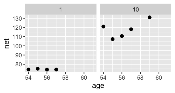
FIGURE 17.19: The observed net running times by age for runners 1 and 10.
In general, let denote a new observation on an observed runner , specifically runner ’s running time at age 61. As in Chapter 16, we can approximate the posterior predictive model for by simulating a prediction from the first layer of (17.3), that which describes the variability in race times , evaluated at each of the 20,000 parameter sets in our MCMC simulation:
The resulting posterior predictive model will reflect two sources of uncertainty in runner ’s race time: the within-group sampling variability (we can’t perfectly predict runner ’s time from their mean model); and posterior variability in , , and (the parameters defining runner ’s relationship between running time and age are unknown and random).
Since we don’t have any data on the baseline speed for our new runner, Miles, there’s a third source of uncertainty in predicting his race time: between-group sampling variability (baseline speeds vary from runner to runner).
Though we recommend doing these simulations “by hand” to connect with the concepts of posterior prediction (as we did in Chapter 16), we’ll use the posterior_predict() shortcut function to simulate the posterior predictive models for our three runners:
# Simulate posterior predictive models for the 3 runners
set.seed(84735)
predict_next_race <- posterior_predict(
  running_model_1,
  newdata = data.frame(runner = c("1", "Miles", "10"),
                       age = c(61, 61, 61)))
These posterior predictive models are plotted in Figure 17.20. As anticipated from their previous trends, our posterior expectation is that runner 10 will have a slower time than runner 1 when they’re 61 years old. Our posterior predictive model for Miles’ net time is somewhere in between these two extremes. The posterior median prediction is just under 100 minutes, similar to what we’d get if we plugged an age of 61 into the global posterior median model for the average runner:
B0 + B1 * 61
[1] 98.54
That is, without any information about Miles, our default assumption is that he’s an average runner. Our uncertainty in this assumption is reflected by the relatively wide posterior predictive model. Naturally, having observed data on runners 1 and 10, we’re more certain about how fast they will be when they’re 61. But Miles is a wild card – he could be really fast or really slow!
# Posterior predictive model plots
mcmc_areas(predict_next_race, prob = 0.8) +
 ggplot2::scale_y_discrete(labels = c("runner 1", "Miles", "runner 10"))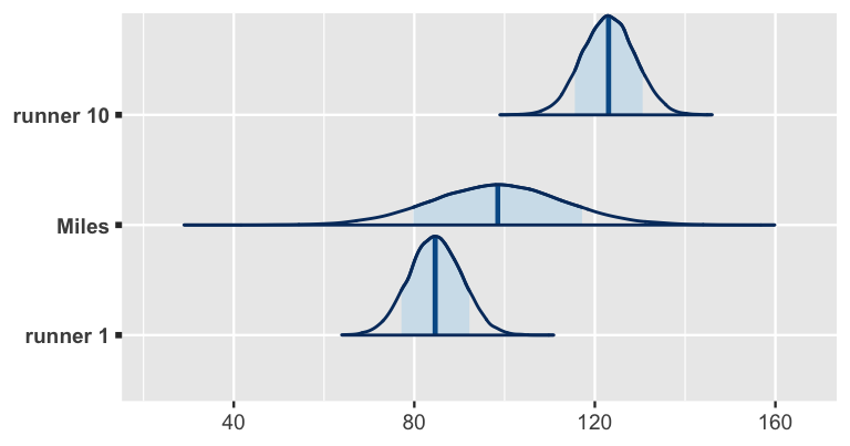
FIGURE 17.20: Posterior predictive models for the net running times at age 61 for sample runners 1 and 10, as well as Miles, a runner that wasn’t in our original sample.
17.6 Details: Longitudinal data
The running data on net times by age is longitudinal.
We observe each runner over time, where this time (or aging) is of primary interest.
Though our hierarchical models of this relationship account for the correlation in running times within any runner, they make a simplifying assumption about this correlation: it’s the same across all ages.
In contrast, you might imagine that observations at one age are more strongly correlated with observations at similar ages.
For example, a runner’s net time at age 60 is likely more strongly correlated with their net time at age 59 than at age 50.
It’s beyond the scope of this book, but we can adjust the structure of our hierarchical models to account for a longitudinal correlation structure.
We encourage the interested reader to check out the bayeslongitudinal R package (Carreño and Cuervo 2017) and the foundational paper by Laird and Ware (1982).
17.7 Example: Danceability
Let’s implement our hierarchical regression tools in a different context, by revisiting our spotify data from Chapter 16.
There we studied a hierarchical model of song popularity, accounting for the fact that we had grouped data with multiple songs per sampled artist.
Here we’ll switch our focus to a song’s danceability and how this might be explained by two features: its genre and valence or mood.
The danceability and valence of a song are both measured on a scale from 0 (low) to 100 (high).
Thus, lower valence scores are assigned to negative / sad / angry songs and higher scores to positive / happy / euphoric songs.
Starting out, we have a vague sense that the typical song has a danceability rating around 50, yet we don’t have any strong prior understanding of the possible relationship between danceability, genre, and valence, nor how this might differ from artist to artist. Thus, we’ll utilize weakly informative priors throughout our analysis. Moving on from the priors, load the data necessary to this analysis:
# Import and wrangle the data
data(spotify)
spotify <- spotify %>%
  select(artist, title, danceability, valence, genre)
Figure 17.21 illustrates both some global and artist-specific patterns in the relationships among these variables:
ggplot(spotify, aes(y = danceability, x = genre)) +
  geom_boxplot()
ggplot(spotify, aes(y = danceability, x = valence)) +
  geom_point()
ggplot(spotify, aes(y = danceability, x = valence, group = artist)) +
  geom_smooth(method = "lm", se = FALSE, size = 0.5)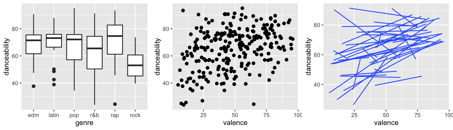
FIGURE 17.21: The relationship of danceability with genre (left) and valence (middle) for individual songs. The relationship of danceability with valence by artist (right).
When pooling all songs together, notice that rock songs tend to be the least danceable and rap songs the most (by a slight margin).
Further, danceability seems to have a weak but positive association with valence.
Makes sense.
Sad songs tend not to inspire dance.
Taking this all with a grain of salt, recall that the global models might mask what’s actually going on.
To this end, the artist-specific models in the final plot paint a more detailed picture.
The two key themes to pick up on here are that (1) some artists’ songs tend to be more danceable than others, and (2) the association between danceability and valence might differ among artists, though it’s typically positive.
To model these relationships, let’s define some notation.
For song within artist , let denote danceability and denote valence.
Next, note that there are 6 different genres, edm being the baseline or reference.
Thus, we must define 5 additional predictors, one for each non-edm genre.
Specifically, let be indicators of whether a song falls in the latin, pop, r&b, rap, and rock genres, respectively.
For example,
Thus, for an edm song, all genre indicators are 0.
We’ll consider two possible models of danceability by valence and genre.
The first layer of Model 1 assumes that with
The global coefficients reflect an assumption that the relationships between danceability, valence, and genre are similar for each artist. Yet the artist-specific intercepts assume that, when holding constant a song’s valence and genre, some artists’ songs tend to be more danceable than other artists’ songs.
The first layer of Model 2 incorporates additional artist-specific valence coefficients, assuming with
Thus, unlike Model 1, Model 2 assumes that the relationship between danceability and valence might differ by artist. This is consistent with the artist-specific models above – for most artists, danceability increased with the happiness of a song. For others, it decreased. Both models are simulated utilizing the following weakly informative priors:
spotify_model_1 <- stan_glmer(
  danceability ~ valence + genre + (1 | artist),
  data = spotify, family = gaussian,
  prior_intercept = normal(50, 2.5, autoscale = TRUE),
  prior = normal(0, 2.5, autoscale = TRUE),
  prior_aux = exponential(1, autoscale = TRUE),
  prior_covariance = decov(reg = 1, conc = 1, shape = 1, scale = 1),
  chains = 4, iter = 5000*2, seed = 84735)

spotify_model_2 <- stan_glmer(
  danceability ~ valence + genre + (valence | artist),
  data = spotify, family = gaussian,
  prior_intercept = normal(50, 2.5, autoscale = TRUE),
  prior = normal(0, 2.5, autoscale = TRUE),
  prior_aux = exponential(1, autoscale = TRUE),
  prior_covariance = decov(reg = 1, conc = 1, shape = 1, scale = 1),
  chains = 4, iter = 5000*2, seed = 84735)

# Check out the prior specifications
prior_summary(spotify_model_1)
prior_summary(spotify_model_2)
Posterior predictive checks of these two models are similar, both models producing posterior simulated datasets of song danceability that are consistent with the main features in the original song data.
pp_check(spotify_model_1) +
  xlab("danceability")
pp_check(spotify_model_2) +
  xlab("danceability")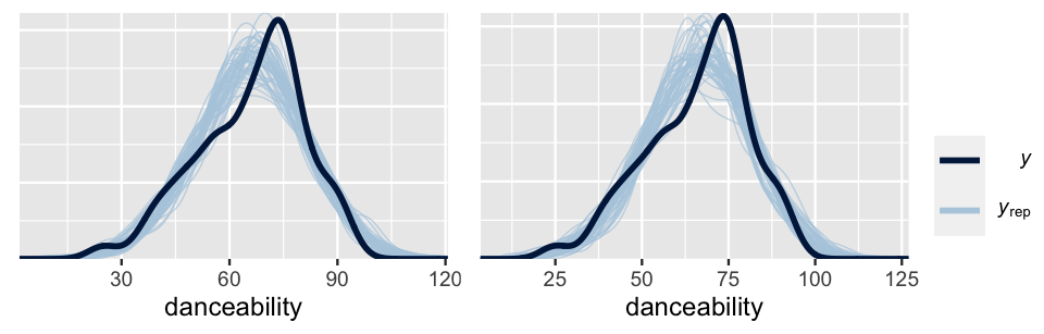
FIGURE 17.22: Posterior predictive checks of Spotify Model 1 (left) and Model 2 (right).
Yet upon a comparison of their ELPDs, we think it’s best to go forward with Model 1. The quality of the two models do not significantly differ, and Model 1 is substantially simpler. Without more data per artist, it’s difficult to know if the artist-specific valence coefficients are insignificant due to the fact that the relationship between danceability and valence doesn’t vary by artist, or if we simply don’t have enough data per artist to determine that it does.
# Calculate ELPD for the 2 models
elpd_spotify_1 <- loo(spotify_model_1)
elpd_spotify_2 <- loo(spotify_model_2)

# Compare the ELPD
loo_compare(elpd_spotify_1, elpd_spotify_2)
                elpd_diff se_diff
spotify_model_2  0.0       0.0
spotify_model_1 -5.3       3.0
Digging into Model 1, first consider posterior summaries for the global model parameters (.
For the average artist in any genre, we’d expect danceability to increase by between 2.16 and 3 points for every 10-point increase on the valence scale – a statistically significant but fairly marginal bump.
Among genres, it appears that when controlling for valence, only rock is significantly less danceable than edm.
Its 80% credible interval is the only one to lie entirely above or below 0, suggesting that for the average artist, the typical danceability of a rock song is between 1.42 and 12 points lower than that of an edm song with the same valence.
tidy(spotify_model_1, effects = "fixed",
     conf.int = TRUE, conf.level = 0.80)
# A tibble: 7 x 5
  term        estimate std.error conf.low conf.high
  <chr>          <dbl>     <dbl>    <dbl>     <dbl>
1 (Intercept)   53.3      3.02     49.4      57.1
2 valence        0.258    0.0330    0.216     0.300
3 genrelatin     0.362    3.58     -4.15      5.02
4 genrepop       0.466    2.67     -2.96      3.89
5 genrer&b      -2.43     2.85     -6.05      1.22
6 genrerap       1.68     3.15     -2.29      5.68
7 genrerock     -6.73     4.14    -12.0      -1.42
In interpreting these summaries, keep in mind that the genre coefficients directly compare each genre to edm alone and not, say, rock to r&b.
In contrast, mcmc_areas() offers a useful visual comparison of all genre posteriors.
Other than the rock coefficient, 0 is a fairly posterior plausible value for the other genre coefficients, reaffirming that these genres aren’t significantly more or less danceable than edm.
There’s also quite a bit of overlap in the posteriors.
As such, though there’s evidence that some of these genres are more danceable than others (e.g., rap vs r&b), the difference isn’t substantial.
# Plot the posterior models of the genre coefficients
mcmc_areas(spotify_model_1, pars = vars(starts_with("genre")), prob = 0.8) +
  geom_vline(xintercept = 0)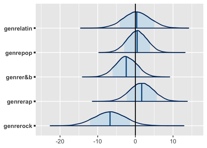
FIGURE 17.23: Posterior models for the genre-related coefficients in Spotify Model 1.
Finally, consider some posterior results for two artists in our sample: Missy Elliott and Camilo.
The below tidy() summary compares the typical danceability levels of these artists to the average artist, .
When controlling for valence and genre, Elliott’s songs tend to be significantly more danceable than the average artist’s, whereas Camilo’s tend to be less danceable.
For example, there’s an 80% posterior chance that Elliott’s typical song danceability is between 2.78 and 14.8 points higher than average.
tidy(spotify_model_1, effects = "ran_vals",
     conf.int = TRUE, conf.level = 0.80) %>%
  filter(level %in% c("Camilo", "Missy_Elliott")) %>%
  select(level, estimate, conf.low, conf.high)
# A tibble: 2 x 4
  level         estimate conf.low conf.high
  <chr>            <dbl>    <dbl>     <dbl>
1 Camilo           -2.00    -7.29      3.44
2 Missy_Elliott     8.69     2.78     14.8
To predict the danceability of their next songs, our hierarchical regression model takes into consideration the artists’ typical danceability levels as well as the song’s valence and genre.
Suppose that both artists’ next songs have a valence score of 80, but true to their genres, Elliot’s is a rap song and Camilo’s is in the Latin genre.
Figure 17.24 plots both artists’ posterior predictive models along with that of Mohsen Beats, a rock artist that wasn’t in our sample but also releases a song with a valence level of 80.
As we’d expect, the danceability of Elliott’s song is likely to be the highest among these three.
Further, though Camilo’s typical danceability is lower than average, we expect Mohsen Beats’s song to be even less danceable since it’s of the least danceable genre.
# Simulate posterior predictive models for the 3 artists
set.seed(84735)
predict_next_song <- posterior_predict(
  spotify_model_1,
  newdata = data.frame(
    artist = c("Camilo", "Mohsen Beats", "Missy Elliott"),
    valence = c(80, 60, 90), genre = c("latin", "rock", "rap")))

# Posterior predictive model plots
mcmc_areas(predict_next_song, prob = 0.8) +
 ggplot2::scale_y_discrete(
   labels = c("Camilo", "Mohsen Beats", "Missy Elliott"))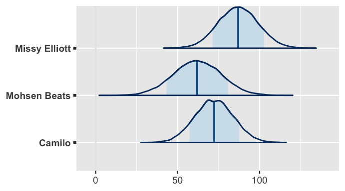
FIGURE 17.24: Posterior predictive models for the popularity of the next songs by Missy Elliott, Mohsen Beats, and Camilo.
One last thing
If you’re paying close attention, you might notice a flaw in our model. It produces posterior predictions of danceability that exceed the maximum danceability level of 100. This is a consequence of using the Normal to model a response variable with a limited range (here 0 - 100). The Normal assumption was “good enough” here, but we might consider replacing it with, say, a Beta model.
17.8 Chapter summary
In Chapter 17 we explored how to build a hierarchical model of by predictors when working with group structured or hierarchical data. Suppose we have multiple data points on each of groups. For each group , let and denote the th set of observed data on response variable and different predictors . Then a Normal hierarchical regression model of vs consists of three layers: it combines information about the relationship between and within groups, with information about how these relationships vary between groups, with our prior understanding of the broader global population. Letting denote a set of group-specific parameters and () a set of global parameters:
Where we have some choices to make is in the definition of the regression mean . In the simplest case of a random intercepts model, we assume that groups might have unique baselines , yet share a common relationship between and :
In the most complicated case of a random intercepts and slopes model, we assume that groups have unique baselines and unique relationships between and each :
In between, we might assume that some predictors need group-specific coefficients and others don’t:
17.9 Exercises
17.9.1 Conceptual exercises
- Not only do some people tend to react more quickly than others, sleep deprivation might impact some people’s reaction times more than others.
- Though some people tend to react more quickly than others, the impact of sleep deprivation on reaction time is the same for all.
- Nobody has inherently faster reaction times, though sleep deprivation might impact some people’s reaction times more than others.
- Sketch a plot of data that we might see if .
- Explain what would mean in the context of the sleep study.
- Repeat part a assuming .
- Repeat part b assuming .
- Sketch a plot of subject-specific trends that we might see if the correlation parameter were positive .
- Explain what would mean in the context of the sleep study.
- Repeat part a for .
- Repeat part b for .
- Write out formal model notation for model 1, a random intercepts model of vs .
- Write out formal model notation for model 2, a random intercepts and slopes model of vs .
- Summarize the key differences in the assumptions behind models 1 and 2. Root this discussion in the puppy context.
weight and height data for the puppy study. Write out appropriate stan_glmer() model code for models 1 and 2 from Exercise 17.4.
17.9.2 Applied exercises
sleepstudy data from the lme4 package to better understand reaction times. Specifically, consider two possible models as expressed by stan_glmer() syntax:
| model | formula |
|---|---|
| 1 | Reaction ~ Days + (1 | Subject) |
| 2 | Reaction ~ Days + (Days | Subject) |
- What’s the grouping variable in the
sleepstudydata and why is it important to incorporate this grouping structure into our analysis? - Use formal notation to define the hierarchical regression structure of models 1 and 2. (You will tune the priors in the next exercise.)
- Summarize the key differences between models 1 and 2. Root this discussion in the sleep study.
- Using the
sleepstudydata, construct and discuss a plot that helps you explore which model is more appropriate: 1 or 2.
- Simulate the posteriors of models 1 and 2. Remember to use a baseline reaction time of 250ms, and weakly informative priors otherwise.
- For model 2, report the global posterior median regression model of
Reactiontime. - For model 2, construct and interpret 80% credible intervals for the
Daysregression coefficient. - For model 2, calculate and interpret the posterior medians of , , , and .
- Use your posterior simulation to identify the person for whom reaction time changes the least with sleep deprivation. Write out their posterior median regression model.
- Repeat part a, this time for the person for whom reaction time changes the most with sleep deprivation.
- Use your posterior simulation to identify the person that has the slowest baseline reaction time. Write out their posterior median regression model.
- Repeat part c, this time for the person that has the fastest baseline reaction time.
- Simulate, plot, and discuss the posterior predictive model of reaction time after 5 days of sleep deprivation for two subjects: you and Subject 308. You’re encouraged to try this from scratch before relying on the
posterior_predict()shortcut.
- Evaluate the two models of reaction time: Are they wrong? Are they fair? How accurate are their posterior predictions?
- Which of the two models do you prefer and what does this indicate about the relationship between reaction time and sleep deprivation? Justify your answer with posterior evidence.
- Using formal notation, define the hierarchical regression model of vs . In doing so, assume that baseline voice pitch differs from subject to subject, but that the impact of attitude on voice pitch is similar among all subjects.
- Compare and contrast the meanings of model parameters and in the context of this voice pitch study. NOTE: Remember that is a categorical indicator variable.
- Compare and contrast the meanings of model parameters and in the context of this voice pitch study.
- Load the
voicesdata from the bayesrules package. How many study subjects are included in this sample? In how many dialogs did each subject participate? - Construct and discuss a plot which illustrates the relationship between voice pitch and attitude both within and between subjects.
- Simulate the hierarchical posterior model of voice pitch by attitude. Construct and discuss trace plots, density plots, autocorrelation plots, and a
pp_check()of the chain output. - Construct and interpret a 95% credible interval for .
- Construct and interpret a 95% credible interval for .
- Is there ample evidence that, for the average subject, voice pitch differs depending on attitude (polite vs informal)? Explain.
- Report the global posterior median model of the relationship between voice pitch and attitude.
- Report and contrast the posterior median models for two subjects in our data: A and F.
- Using
posterior_predict(), simulate posterior predictive models of voice pitch in a new polite dialog for three different subjects: A, F, and you. Illustrate your simulation results usingmcmc_areas()and discuss your findings.
17.9.3 Open-ended exercises
coffee_ratings_small data from the bayesrules package which contains information for multiple batches of coffee beans from each of 27 farms. You get to choose which predictors to use.
Reaction time by Days of sleep deprivation using priors that you tune yourself. Use prior simulation to illustrate your prior understanding.